
Diagnosis · Updated 24 August 2026
Why this CareSkin before-and-after TikTok slideshow worked
A 12.5M CareSkin before-and-after TikTok slideshow mixed an acne glow-up, an app reveal, and product proof. See what the evidence supports.
The CareSkin acne slideshow worked because its four images form a clean argument: recognise the problem, want the result, see a proposed method, then see the result again. But the live controls break the tempting conclusion that acne, four slides, or a CareSkin screen is a formula.
The cited post reached 12,535,445 plays in a TikHub snapshot on 24 August 2026. Against the 10,026-play median of 25 recent photo posts from the same account, it was a 1,250× outlier. A later post from the same creator also combined an acne story with a personalised CareSkin routine and reached 462 plays. That failed replica is more useful than another hook list.
This is an independent case study of public third-party content, not a reels.chat campaign or customer result. reels.chat did not create or publish the content and has no private campaign analytics for it.
The before-and-after TikTok post and its creator
The cited TikTok is a four-image photo post from @careskinhailey. Its caption tags CareSkin and includes #ad. The public counters recorded 33,781 likes, 454 comments, 841 shares, and 3,092 saves alongside the 12.5 million plays.
Five photo posts from the same creator
Ratios use the 10,026-play median across 25 photo posts in the latest feed snapshot.
Cited breakout
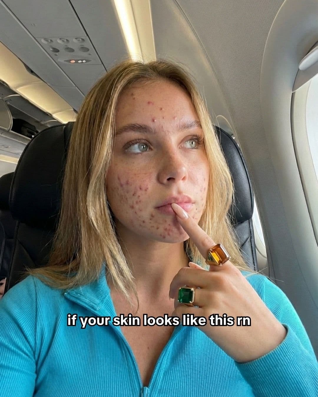

Breakout selfie, result promise, personalised CareSkin routine, then a final clear-skin selfie.
Ordinary same-creator controls
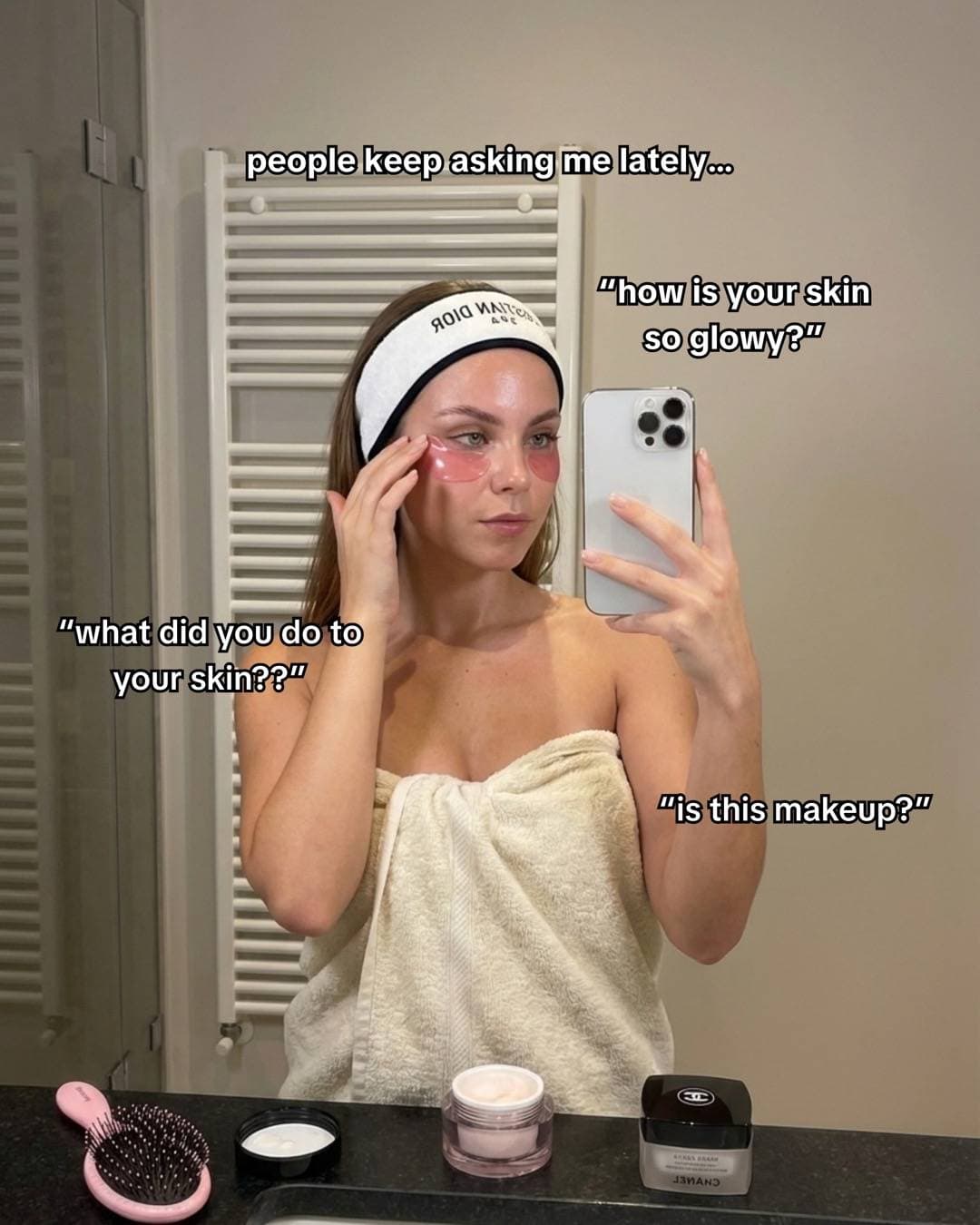
A glow-up opening and personalised CareSkin acne routine, with an ordinary result.
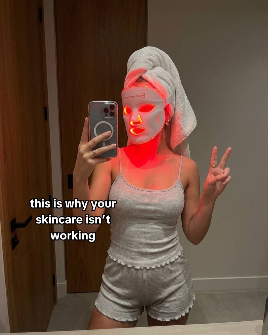
A five-slide claim that the skincare routine was the problem, then a CareSkin explanation.
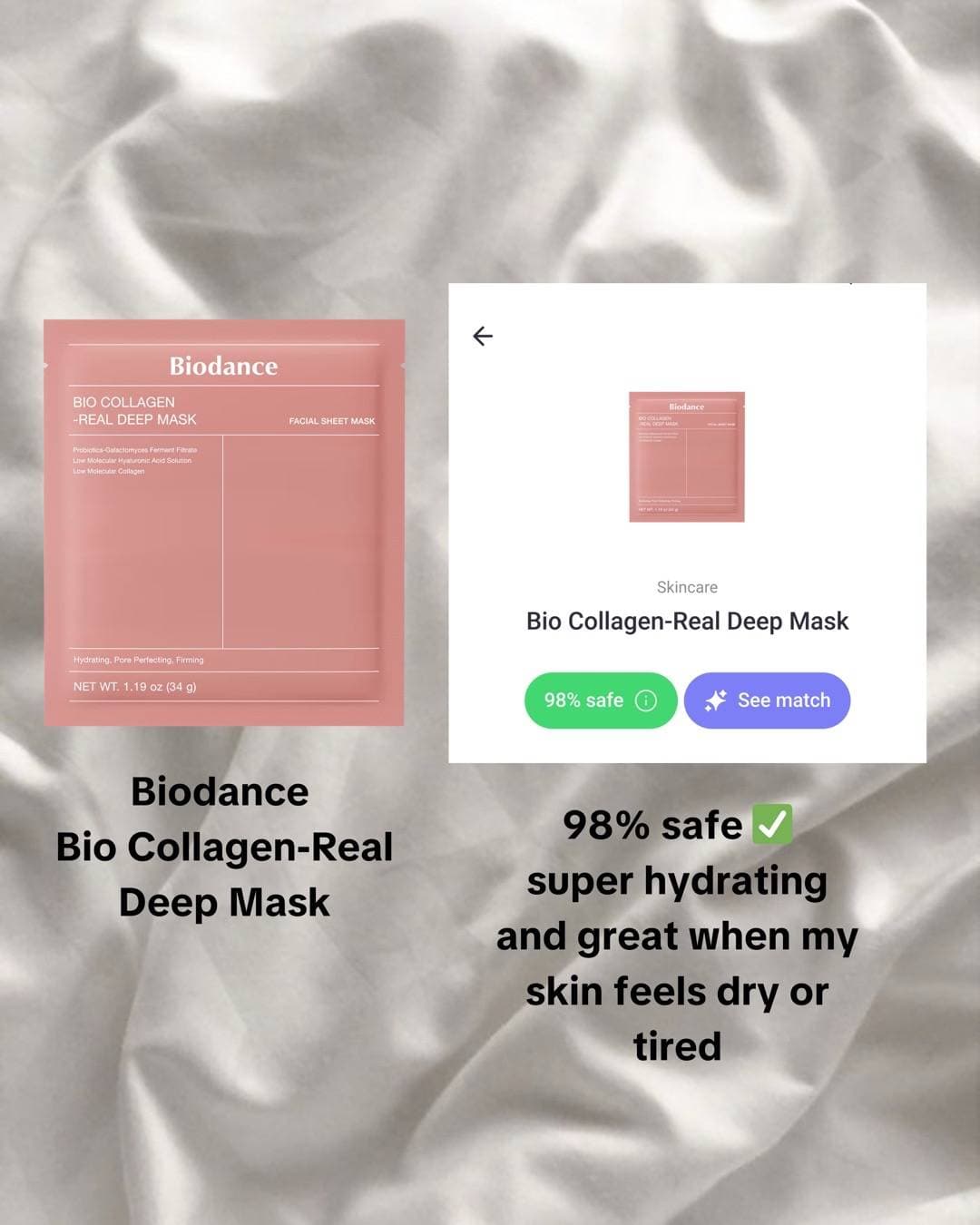
A five-slide facial-mask and ingredient-check post featuring CareSkin.
A six-slide no-more-blind-buying promise built around checking products in CareSkin.
These cards are public snapshots, not conversion analytics. They establish that the post travelled and that similar-looking work from the same account often did not. They do not reveal installs, sales, spend, retention by slide, or whether CareSkin caused any visible skin change.
The post was found through an X explainer. I used that explainer as a hypothesis generator, then hydrated the TikTok, downloaded every slide, and pulled latest and hot posts from the creator. One explainer discussing one winner is not prevalence. It is a lead.
What the four slides actually do
The images are unusually easy to reduce to beats because each one has a separate job.
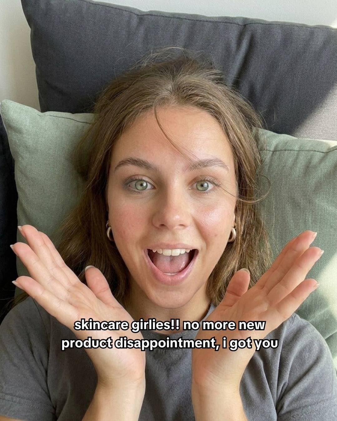
Slide 1, captured 24 August 2026: a problem-identification selfie. The text says, “if your skin looks like this rn.”
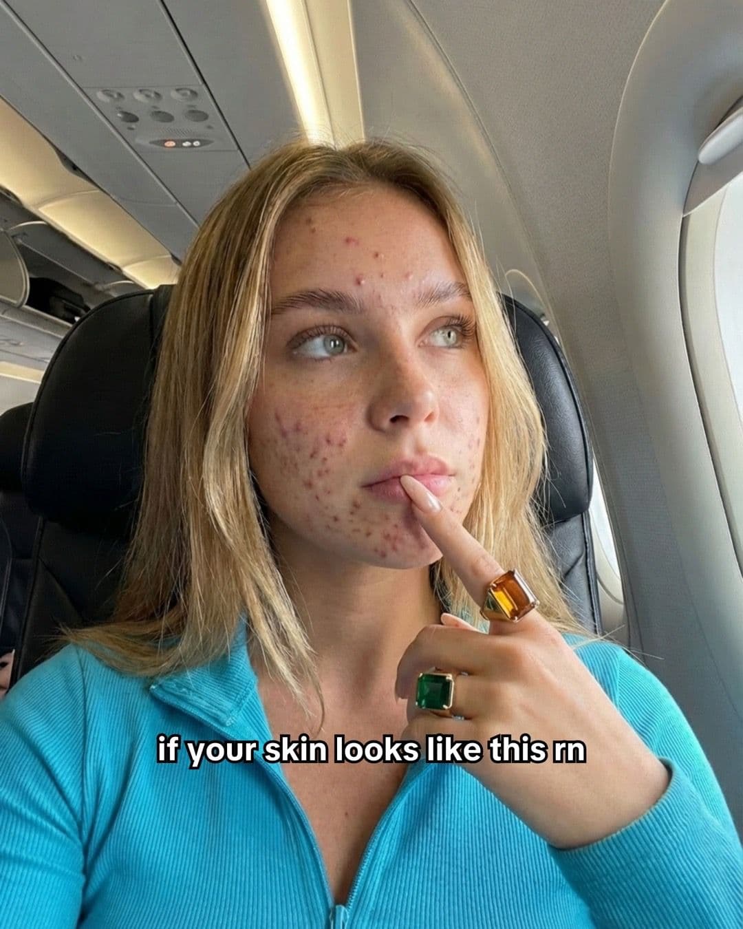
Slide 2, captured 24 August 2026: the claimed result appears immediately. The image promises “a couple of weeks,” which the public post cannot verify.
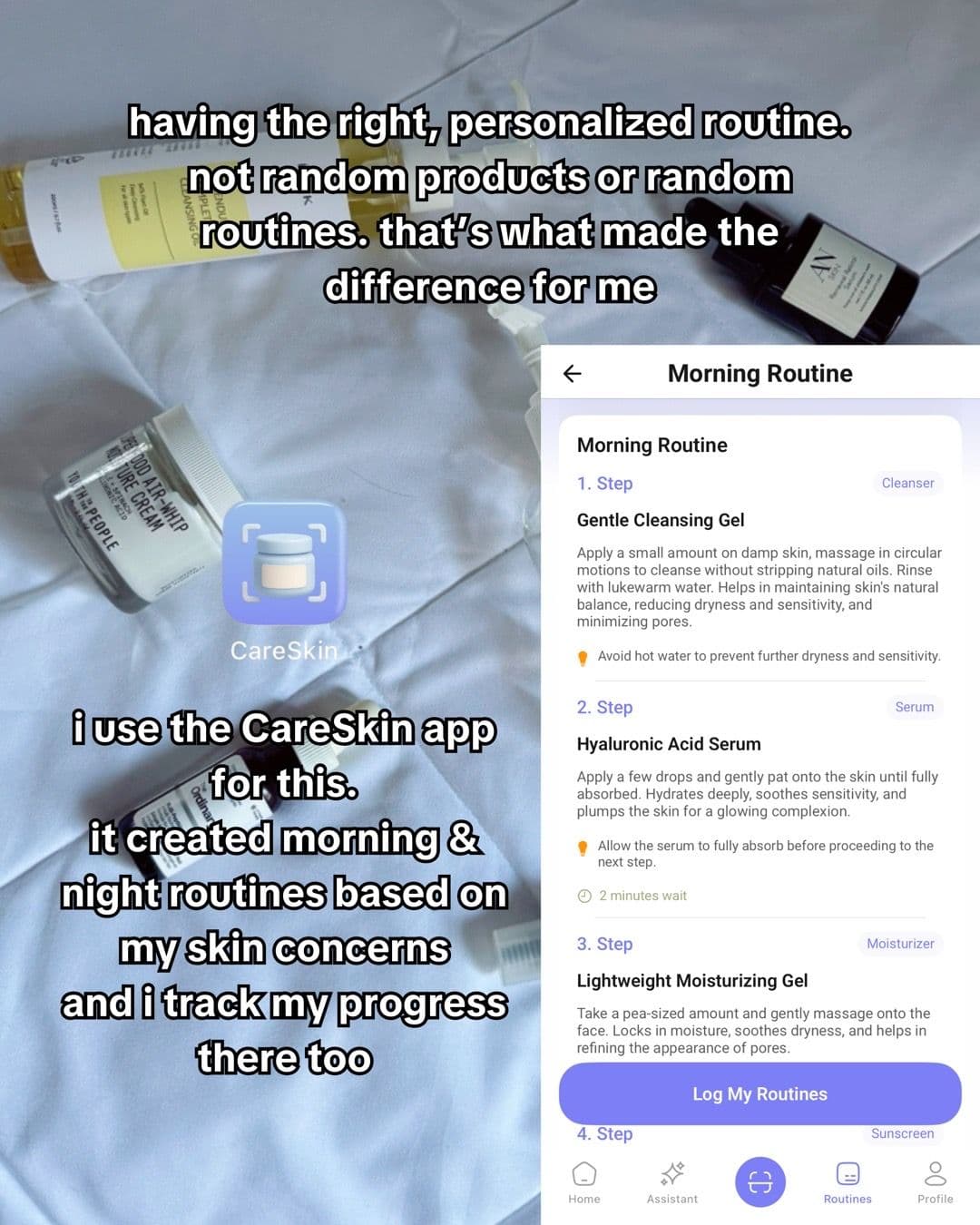
Slide 3, captured 24 August 2026: CareSkin enters as the proposed method, with a visible morning routine and text about personalisation.
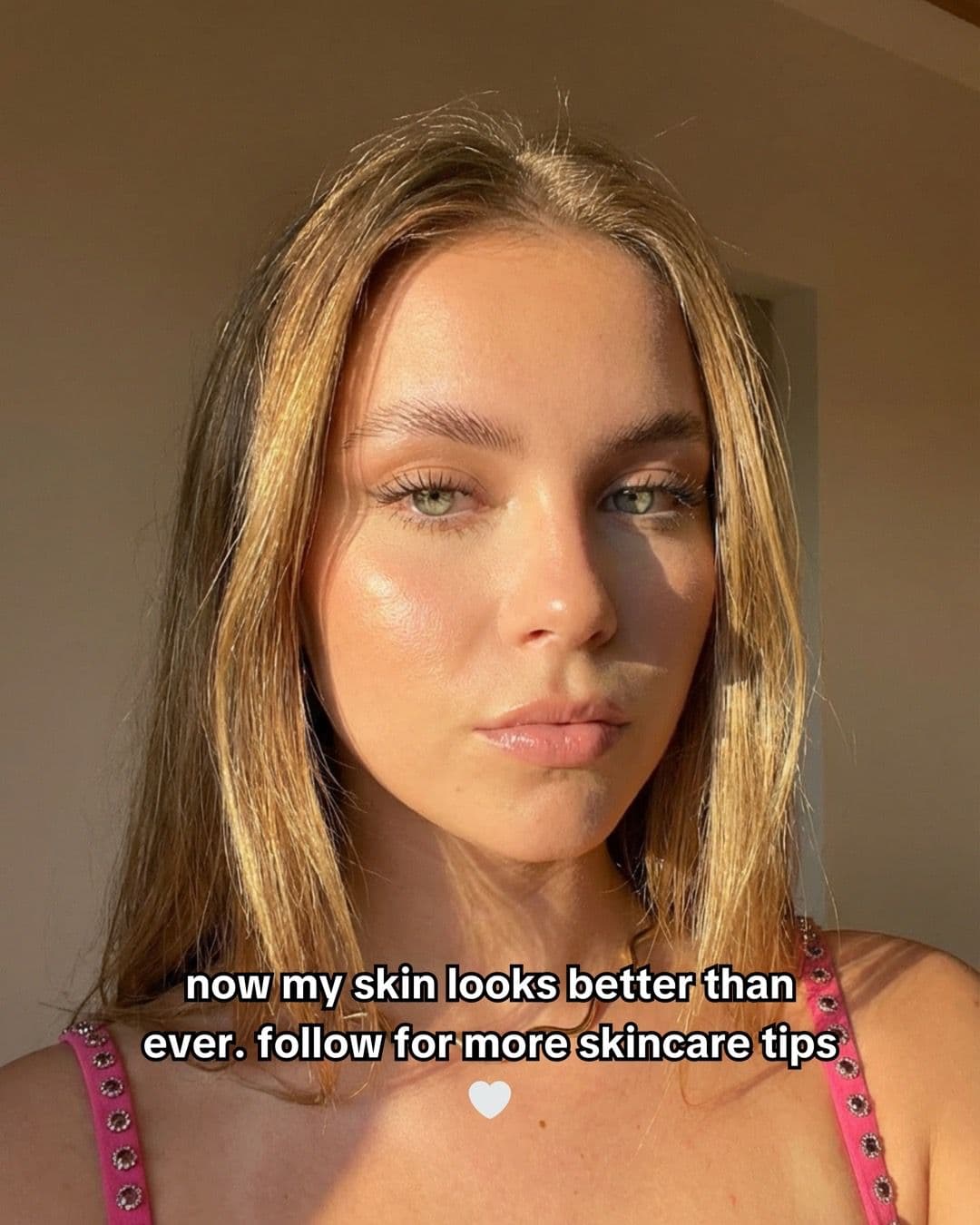
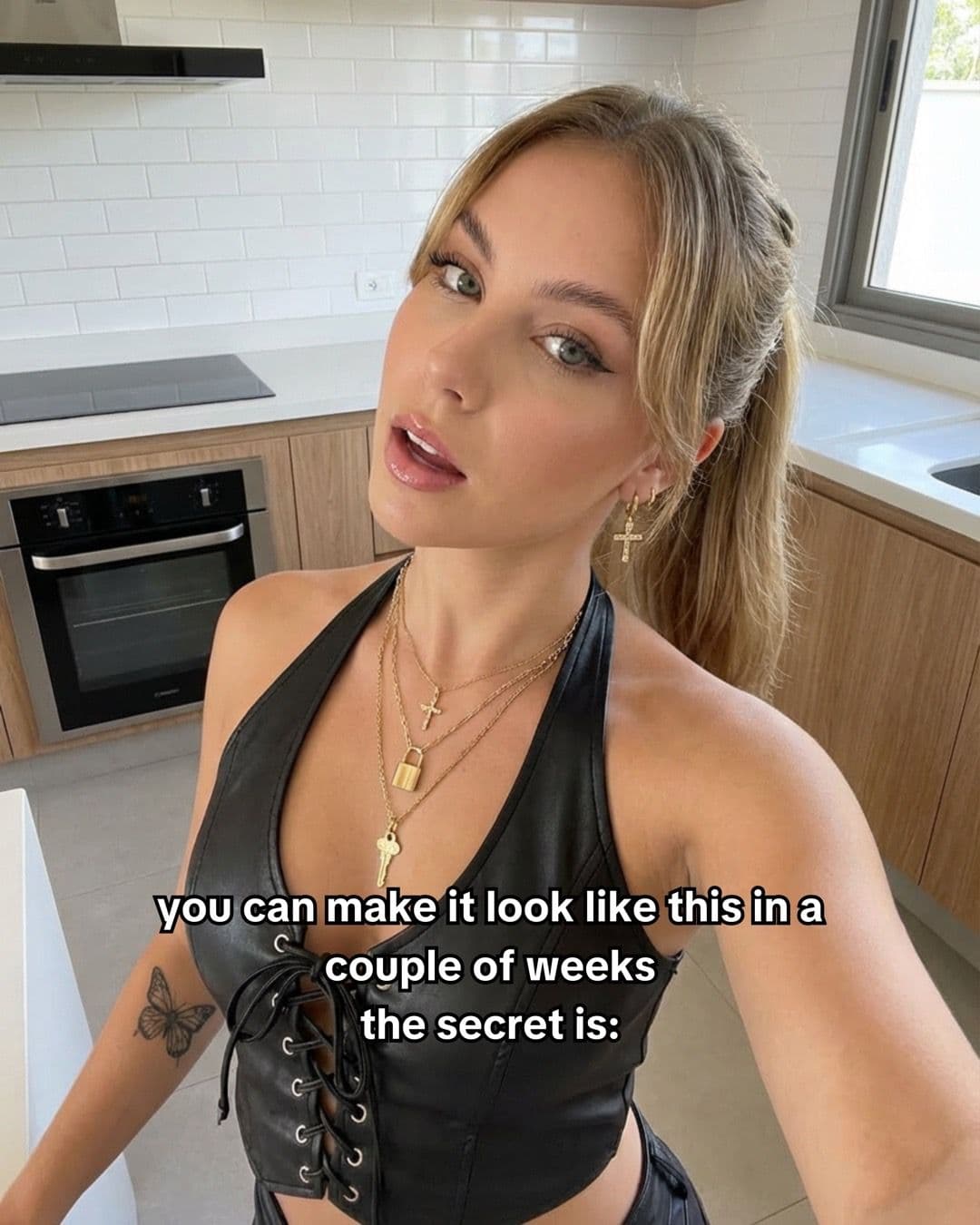
Slide 4, captured 24 August 2026: a second result image closes the sequence and asks viewers to follow for skincare tips.
The beat sheet is:
- Recognition: “If your skin looks like this” lets a viewer self-select into the problem.
- Promise: a clear-skin selfie supplies the desired outcome before asking for an explanation.
- Proposed method: products, the CareSkin icon, and a routine screen connect the sponsor to the change.
- Proof repeat: another clear-skin selfie returns to the outcome after the product interruption.
That is a coherent piece of advertising. It is not proof of the medical timeline presented in the copy. The snapshots show two selfies and a claim about “a couple of weeks”; they do not show dates, treatment adherence, or causation.
Separate the causes before copying anything
Three hypotheses survive inspection. Each needs a different test.
| Possible cause | What the public evidence supports | What a reader could test |
|---|---|---|
| Opening | A visible breakout plus direct “your skin” language identifies the intended viewer, but another acne-and-routine post stayed ordinary | Hold the result and routine slides stable; compare a problem-first opening with a result-first opening |
| Format | Four stills compress problem, promise, method, and repeated result, while other slide counts produced both large and ordinary outcomes | Keep the same claim and assets; compare four stills with another useful slide count or a short routine video |
| Topic–proof loop | The routine screen answers the transformation’s need for an explanation, but a later personalised-routine post reached 462 plays | Keep both selfies; compare a specific routine, a generic app screen, and no app screen |
Several can be true together. The opening can earn the first swipe while the early result earns the next one. The interface can then turn a generic glow-up into a product-shaped explanation. A fourth slide can restore the emotional payoff after an information-heavy screen.
Calling any one of those “the hook” loses the interaction.
Cause 1: the opening filters for the problem
Slide one does not begin with “download CareSkin.” It begins with a recognisable condition and a second-person callout. Someone worried about breakouts can understand the subject before processing a product claim.
That may improve relevance at the opening. It may also create a strong contrast with the polished selfie on slide two. But a raw breakout is not sufficient evidence of a winning hook. We do not have a platform-wide sample of breakout selfies, and the same account published plenty of skincare promises that stayed ordinary.
The clean test changes only the first image and framing. Version A starts with the visible problem. Version B starts with the clear-skin outcome. Version C starts with the product-selection uncertainty that the app claims to solve. The remaining images stay close enough that the result can teach you something about the opening.
Changing the model, lighting, promise, product, and slide sequence at once is technically a test. It is a test of your ability to change everything.
Cause 2: four slides make the argument fast
The sequence has no tutorial detour. The first two images establish pain and payoff. The third supplies the commercial explanation. The fourth repeats the payoff. A viewer can read the entire logic without waiting through a spoken routine.
Still, four is not a magic number. The creator’s hot feed contained million-play CareSkin photo posts with two, three, four, five, and eight slides. It also contained four-slide posts at roughly 1.83 million, 3.86 million, and 5.64 million plays. Those are large outcomes, but all are below the cited 12.54 million.
The latest feed supplies the harder counterexample. A four-slide partnership post had 499 plays. Across 25 photo posts, the median was 10,026. Format alone cannot explain a range that wide.
What four slides did here was give four distinct ideas enough room. If three slides can preserve the same argument, three may be better. If the app recommendation needs evidence, six may be better. The format earns its place by carrying the proof, not by matching the winner’s arithmetic.
Cause 3: the app screen closes a proof loop
Slide three has the hardest job. The audience has already seen a problem and a result. CareSkin now has to look like a plausible bridge between them rather than a sponsor pasted between attractive selfies.
This execution tries to earn the connection. The overlay contrasts a personalised routine with “random products,” names CareSkin, and says the app created morning and night routines. The interface shows steps such as cleanser, serum, and moisturiser. Even at phone size, the screen reads as a routine rather than a generic home page.
That specificity matters to the creative argument. It does not prove clinical effectiveness. It makes the advertisement internally legible: problem, claimed result, proposed method.
The direct counterexample is brutal. A later three-slide photo post from the same account says the creator struggled with acne, tried random products, then built a personalised acne routine on CareSkin. It reached 462 plays in the snapshot, or 0.05× the recent photo median. The topic and product explanation returned. The breakout did not.
So “show a personalised routine after acne” is not enough. The cited post’s stronger first-slide identification, immediate visual contrast, image selection, timing, distribution, or another unmeasured factor may have mattered. Public counters cannot assign credit.
What the controls changed
The latest request returned 33 posts dated 27 January to 30 March 2026: 25 photos and eight videos. Median plays were 6,232 across all posts and 10,026 across photos. The cited winner sat at the oldest edge of that returned window and reached 1,250.29× the photo median.
That ratio makes it a real creator-relative outlier against this slice. It should not be read as the account’s only success. The separate hot feed contained a cluster of million-play CareSkin posts, including several above 9 million. Hot sorting is a winner list, so it cannot replace the latest median, but it changes the story: this account repeatedly found distribution with CareSkin creative. The four-slide acne post was the largest item in the returned hot 20, not a lonely miracle among 60 failures.
The ordinary controls also falsify simpler claims:
- A glow-up question plus a personalised acne routine reached 462 plays.
- “Your skincare isn’t working” plus a CareSkin explanation reached 455.
- A product-check screen and mask recommendation reached 375.
- A “no more blind buying” promise across six slides reached 1,652.
Those posts differ in date, opening, images, and execution, so they are not controlled replicas. They are good enough to reject sufficiency. CareSkin on screen did not guarantee reach. A skincare problem did not guarantee reach. More or fewer than four images did not guarantee reach.
What this case study suggests testing
If you want to test the mechanism on your own content, start with the topic–proof loop because it is the most product-specific part of this example.
Use the same acne opening and the same result images. Build three versions of the explanation:
- a legible personalised routine with specific steps;
- a generic CareSkin screen with no visible recommendation;
- no app screen, only the before-and-after claim.
Keep the rest as stable as practical. Decide in advance what would weaken the hypothesis. If the generic or no-app version matches the specific routine, the interface may not be carrying the argument. If the specific routine wins repeatedly, you have evidence that product proof matters for this creative system.
Then test the opening separately. Do not turn all three variables into a content calendar and call the highest-view post science.
The transferable lesson from this slideshow is not “breakout, glow-up, app, glow-up.” It is that each beat answers the question created by the one before it. The live controls show the sequence is neither necessary nor sufficient. They also give you a cleaner next move: preserve the topic, isolate one cause, and make the next post capable of proving your explanation wrong.
For the full diagnostic process, use why this video worked: define the symptom, list materially different causes, confirm each one, then change the smallest thing that tests it. The same product-screenshot-as-proof pattern appears in why the easyStars sister-taboo slideshow worked.
Keep reading
Diagnosis
TikTok hold rate: when the hook works but viewers leave
Diagnose a weak TikTok hold rate after the hook by checking the promise, pacing, audience fit, and the exact retention metric you are reading.
Diagnosis
Why this Costco snack-list TikTok slideshow worked
A 9.6M Costco snack-list TikTok slideshow put a useful list before the app reveal. See which parts of the app-marketing format are worth testing.
Diagnosis
Why this couple-photo TikTok carousel worked
A 10.4M couple-photo TikTok carousel turned pose inspiration into a five-swipe proof loop. See what made the format useful and repeatable.