
Diagnosis · Updated 24 August 2026
Why this luxury-certs educational TikTok carousel worked
A 1.8M educational TikTok carousel paired a luxury-fashion opening with a practical certificate list. See why the cheat sheet held together.
The first slide looks like a fashion campaign. The next five are a compact directory of free marketing courses. The last explains why anyone should care.
That combination helped @lu.casteli’s seven-slide photo post reach 1,851,448 plays and 207,485 saves in the public snapshot captured on 24 August 2026. It was a real account-level outlier: 29.15 times the median play count of the creator’s latest photo posts.
The tempting conclusion is that luxury photography made public information feel valuable. That is plausible, but incomplete. The same account published polished career and luxury slideshows that stayed ordinary. The stronger diagnosis is that this post joined an aspirational opening to a useful object, then kept proving the career promise slide by slide.
This is an independent case study of public third-party content, not a reels.chat campaign or customer result. reels.chat did not create or publish the content and has no private campaign analytics for it.
The educational TikTok carousel was an outlier, not just a large number
Lu Casteli publishes marketing and career content in a consistent editorial style. That makes her own feed a more useful comparison than a platform-wide average.
The snapshot contained 31 recent posts published between 22 June and 27 August 2025. Twenty-three were photo posts. Their median was 63,516 plays; the mixed-format median was 20,699.
The certifications post had 1,851,448 plays, 243,401 likes, 16,362 shares, 346 comments, and 207,485 saves. Saves equalled 11.21% of plays and sat unusually close to likes. There were almost 600 saves for every comment.
Those ratios do not measure retention or prove why TikTok distributed the post. They do tell us what kind of public response accumulated. People treated the slideshow less like a conversation and more like something they expected to need again.
Six photo posts, one creator, one current counter snapshot
Baseline: 23 photo posts in the latest creator feed, median 63,516 plays. Counts captured 24 August 2026.
Creator-relative breakouts
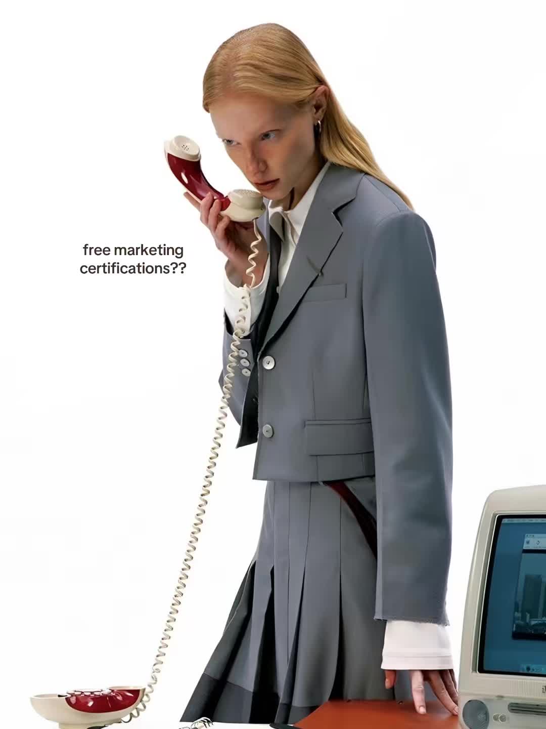

Free marketing certifications, with 207,485 saves in the 24 August snapshot.
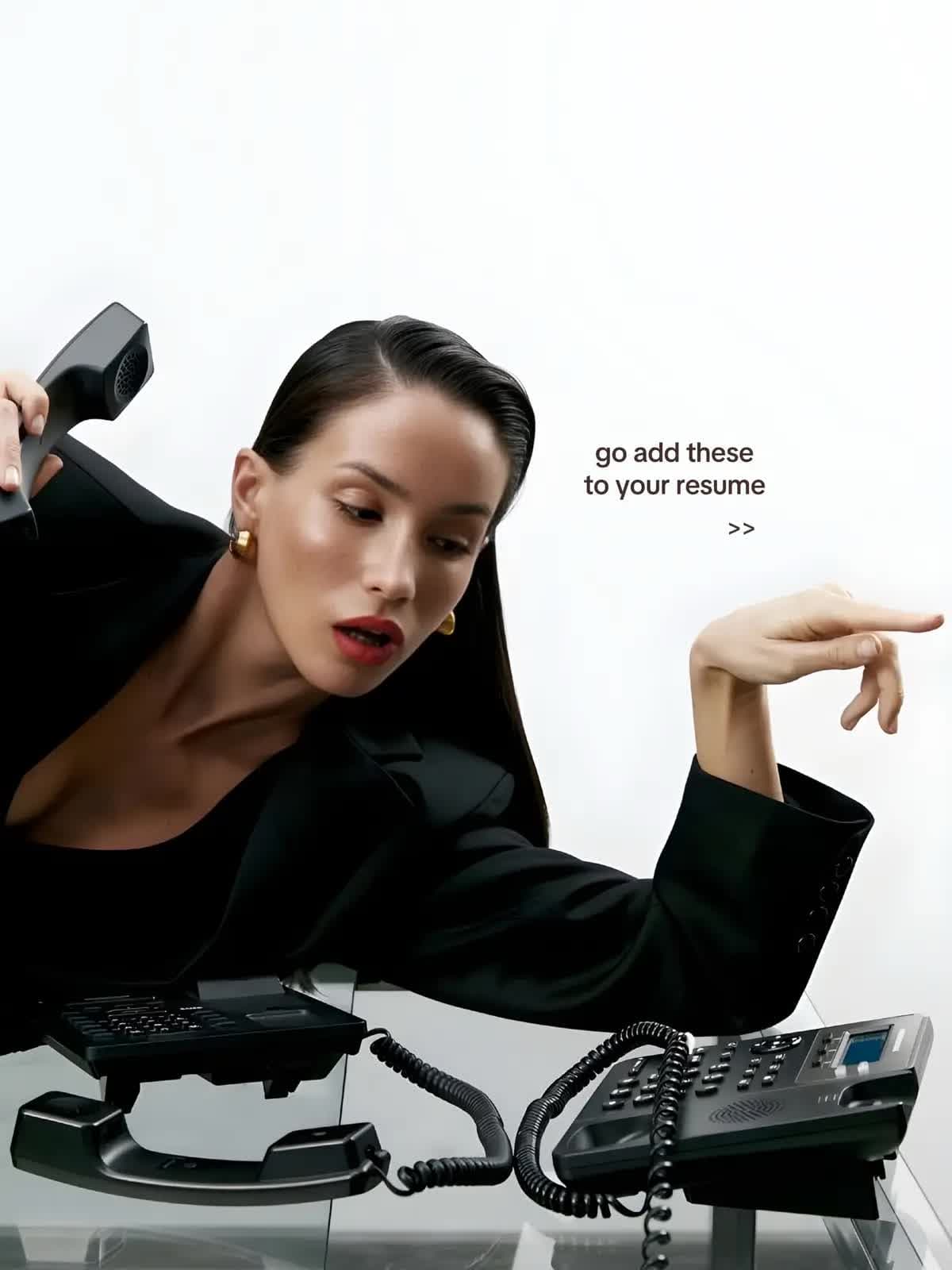
Resume tools in the same editorial career-guide family, with 158,077 saves.
Ordinary same-creator controls
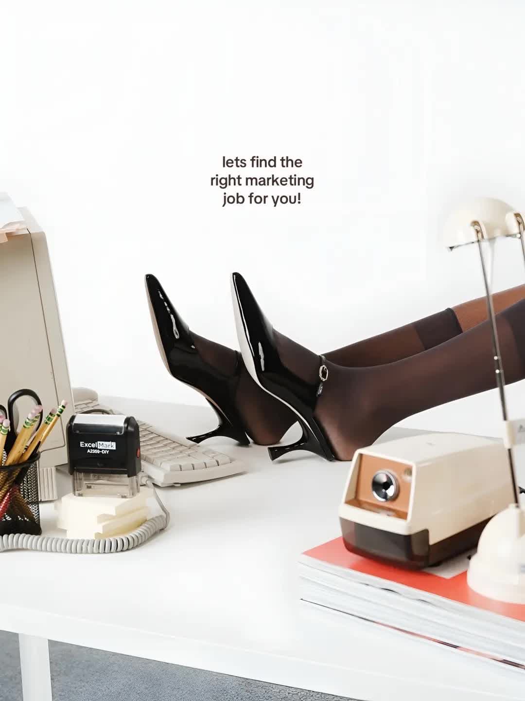
A marketing-job selector with the same polished office language, at the photo-post median.
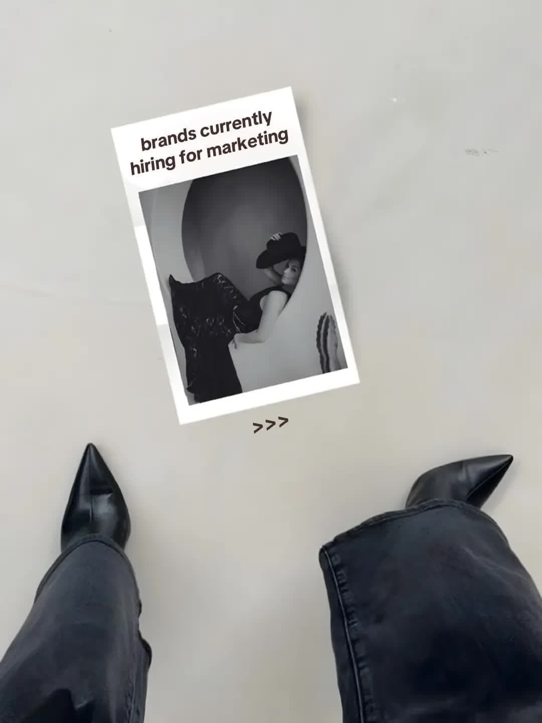
A marketing hiring guide in eight slides, above the median but not a breakout.
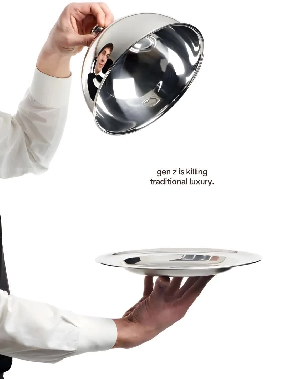
A luxury-branding slideshow whose first slide says Gen Z is killing traditional luxury.
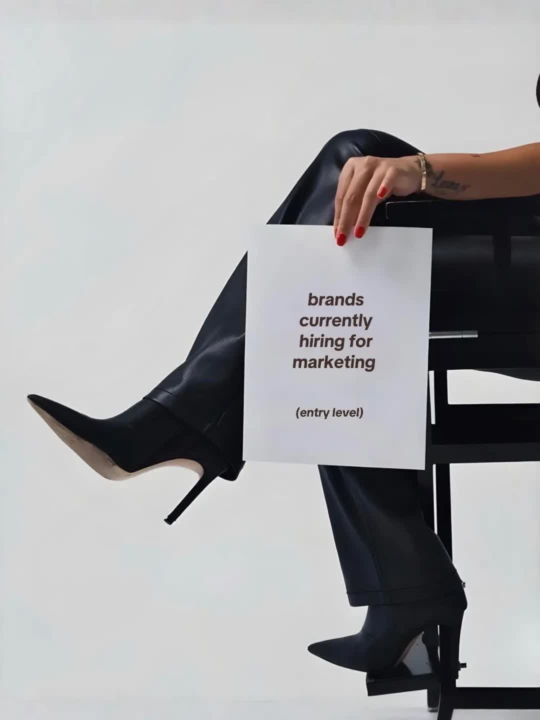
An eight-slide marketing-career post with an ordinary public result.
The controls stop the diagnosis becoming “editorial image plus eight slides.” A polished marketing-job selector landed exactly at the 63,516-play photo median. An eight-slide hiring guide reached 84,505. A 14-slide luxury-branding post reached 31,924, and another eight-slide marketing-career post reached 15,330.
Same creator, related subjects, familiar visual language, very different results.
Start with what the explainer actually claimed
An X explainer published on 6 August 2026 described the post as an “aesthetic utility framework.” That is a useful hypothesis source. It is not evidence that the framework is common or causal.
Reduced to a beat sheet, its argument is:
- Public information was repackaged as a corporate-aesthetic carousel.
- The example offered free marketing certifications from recognisable organisations.
- A 1.8 million view count supplied the proof.
- A fashion image led into named recommendations and a resume-oriented close.
- The implied action was to put luxury photography over useful public links.
The jump happens in the final beat. The post did not simply decorate a list. It made a dry career task feel desirable, divided the research into categories, used familiar institutions as proof, and ended by explaining the practical return.
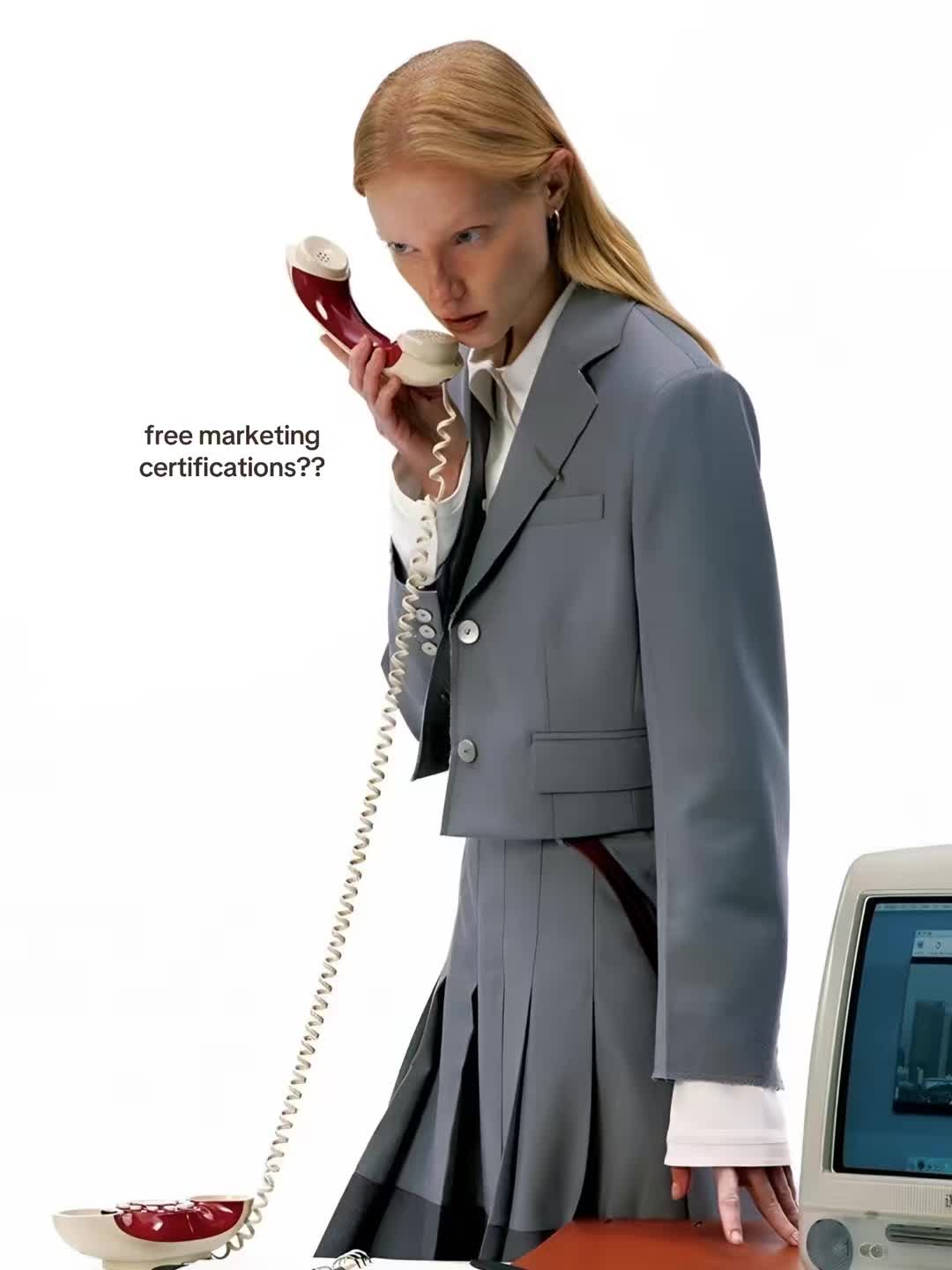
Slide 1, captured from the cited TikTok photo post on 24 August 2026. The editorial image and “free marketing certifications??” question appear together before any course names.
The distinction matters because copying the surface is easy. Finding another fashion photo takes minutes. Building a resource people trust enough to save is the work.
| Possible cause | What the public evidence supports | What a reader could test |
|---|---|---|
| Opening | The editorial image and bounded certification promise appear together, while polished imagery alone also appeared in ordinary controls | Keep the resource fixed; compare the editorial first slide with a plain, readable opening |
| Save-sheet format | The middle groups named resources into useful categories, and saves sat unusually close to likes in the public snapshot | Keep the promise and resources; compare a structured reference sheet with an ungrouped list |
| Topic–proof loop | Recognisable institutions make the career promise concrete, and the final slide explains how the list could be used | Keep the visual treatment; compare specific, checked resources with a generic recommendations list |
The opening sold a world and a task
The first slide combines two desires that are usually presented separately.
One is aspirational: fashion, luxury, corporate polish, and entry into a more desirable professional world. The other is practical: free certifications that might strengthen a marketing resume. The image earns attention, but the question gives that attention somewhere specific to go.
Calling this a pattern interrupt misses the handoff. Plenty of images can look unusual in a feed. A useful opening predicts the value behind it. Here, the visual says “desirable marketing career” while the copy promises a low-cost step toward one.
That also explains why the luxury-branding control matters. Its first slide used an editorial service image and the claim “gen z is killing traditional luxury.” It had 31,924 plays. Luxury styling was present; the compact, personally actionable payoff was not.
The clean opening test would keep the certification list, order, caption, and final slide fixed. Change only the first slide: editorial fashion treatment versus plain typography. Compare continuation and save rate. If the editorial version improves continuation but not saves, the image earned attention while the sheet earned storage.
The middle turned browsing into collection
Slides two through six do not dump a page of links. They sort the options into social and content, fashion marketing, artificial intelligence, design and creative tools, and strategy and data.
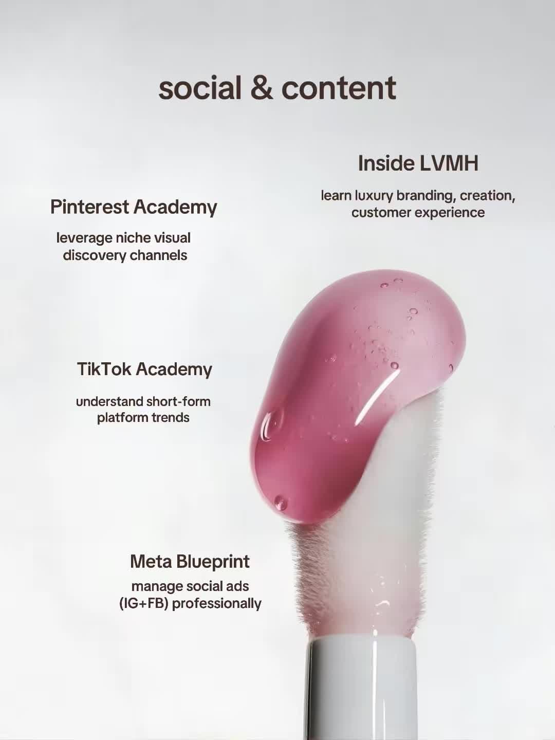
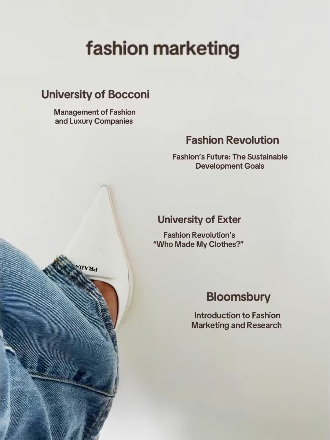

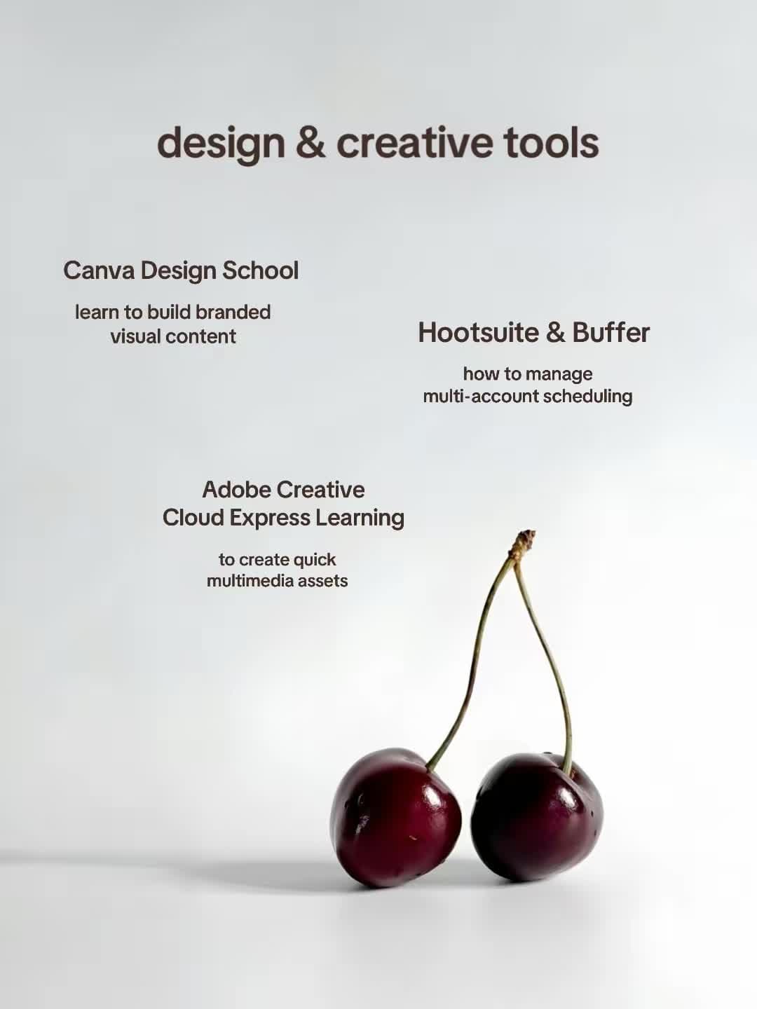

Each category gives the viewer a smaller decision. Someone interested in social content can inspect one slide. Someone applying to fashion roles can keep another. The sequence behaves like a short reference pack rather than a spoken list that must be replayed to recover item four.
This is why the save count matters to the format hypothesis. A slideshow lets viewers move at their own pace and return when they are at a laptop updating a resume. A single image would compress too much information. A video could explain the same resources, but retrieving one provider later would be awkward.
Seven slides are not a magic number. The controls include six, eight, and 14-slide posts with ordinary results. The supported claim is narrower: a short multi-image format matched information people had a reason to revisit.
Named institutions kept proving the promise
The middle slides feature names such as Pinterest Academy, Inside LVMH, TikTok Academy, Meta Blueprint, Salesforce, HubSpot, Canva, Adobe, Google Digital Garage, and Coursera. Those names make “career-improving certifications” concrete.
They also reduce the distance between the opening image and the practical list. Inside LVMH belongs naturally beside the luxury frame. Meta and TikTok support the social-content category. Google and HubSpot make the strategy section legible to a marketing audience.
This does not verify that every course remains free or provides a shareable certificate today. The captured slides establish what the post displayed. Anyone publishing an updated version should check every offer instead of inheriting a year-old claim from a screenshot.
The topic–proof loop is still visible: slide one promises free marketing certifications, the middle supplies recognisable options by job area, and slide seven returns to the reason for doing them.
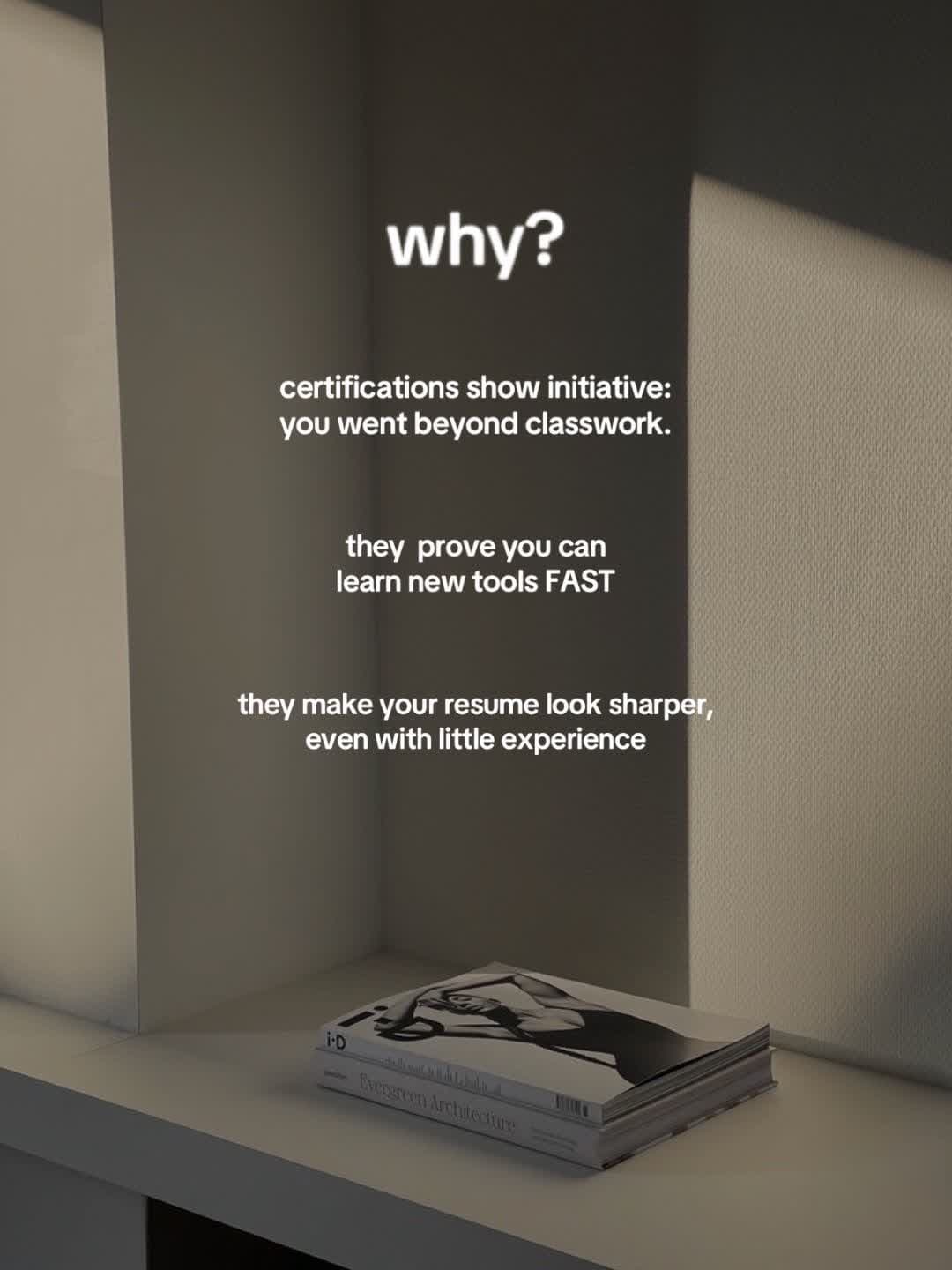
Slide 7, captured from the cited post on 24 August 2026. The close turns the directory into a career action by naming initiative, learning tools, and resume value.
Without that close, the post ends as a directory. Without named providers, the career promise lacks visible support. Without the opening, the same research may feel like homework. The parts reinforce one another.
A second breakout sharpens the diagnosis
The same creator published an eight-slide post about tools to add to a resume. It reached 1,543,362 plays and 158,077 saves, or 24.30 times the latest photo-post median.
Two breakouts from one creator do not establish a platform trend. They do weaken the theory that the exact phrase “free certifications” or one red-telephone image caused everything. Both posts packaged career utility in the same editorial family, offered named things to keep, and framed the list around a resume outcome.
The ordinary controls are equally important. Polished marketing imagery, a career topic, or eight slides appeared elsewhere without producing a breakout. The reusable mechanism is more specific than any one ingredient: an aspirational entrance, a bounded information object, recognisable proof, and a clear later use.
What this case study suggests testing
If you want to test the mechanism on your own content, run two small tests separately.
First, test the opening. Hold the certification promise and all later slides stable. Compare the editorial photograph with a plain, readable first slide. Measure continuation through the carousel and saves per play, not views alone.
Second, test the proof loop. Keep the editorial treatment stable. Compare a coherent set of named certifications tied to a resume use case with a generic resources list. Recheck every resource before publishing.
Do not change the image, subject, list quality, slide count, and close at once. That produces two pieces of content and no diagnosis.
The public evidence cannot assign credit between the opening, topic, timing, account history, or TikTok’s distribution. It cannot reveal private retention, traffic sources, or conversions. It can support a practical decision: test the fashion frame, but keep the useful object intact.
The lesson is not “put a model on slide one.” The post worked as a seven-slide agreement. The first image made the career outcome desirable, the middle made it credible and saveable, and the last slide told the viewer what to do with it.
The parent method, why this video worked, is the reusable process: list causes, find controls, then change one thing. The same save-sheet diagnosis appears on the Costco snack-list slideshow.
Keep reading
Diagnosis
TikTok hold rate: when the hook works but viewers leave
Diagnose a weak TikTok hold rate after the hook by checking the promise, pacing, audience fit, and the exact retention metric you are reading.
Diagnosis
Why this CareSkin before-and-after TikTok slideshow worked
A 12.5M CareSkin before-and-after TikTok slideshow mixed an acne glow-up, an app reveal, and product proof. See what the evidence supports.
Diagnosis
Why this Costco snack-list TikTok slideshow worked
A 9.6M Costco snack-list TikTok slideshow put a useful list before the app reveal. See which parts of the app-marketing format are worth testing.